How Responsive Images Improve Website Performance
2/9/2026 • 13 min read

How Responsive Images Improve Website Performance
Responsive images are a simple way to make websites load faster and perform better. By serving the right image size for each device, they cut down on unnecessary data usage, speed up load times, and improve user experience. Here's why they matter:
- Faster Loading: Smaller, optimized images reduce the time it takes for a page to load, especially on mobile devices.
- Better Rankings: Search engines prioritize fast-loading sites, and optimized images help improve key metrics like Largest Contentful Paint (LCP).
- Lower Costs: Serving smaller images saves bandwidth, reducing costs for both users and website owners.
- Improved User Experience: Clear, sharp images tailored to device screens enhance visual quality without slowing down the site.
Responsive images use HTML tools like srcset, sizes, and the <picture> element to deliver the best version of an image based on screen size, resolution, and network conditions. This approach ensures efficiency and better performance without compromising quality. Ready to optimize your site? Start by implementing these techniques today.
Make Your Site Lightning Fast With Responsive Images
sbb-itb-641714f
Problems Caused by Non-Responsive Images
Responsive vs Non-Responsive Images: Performance Impact Comparison
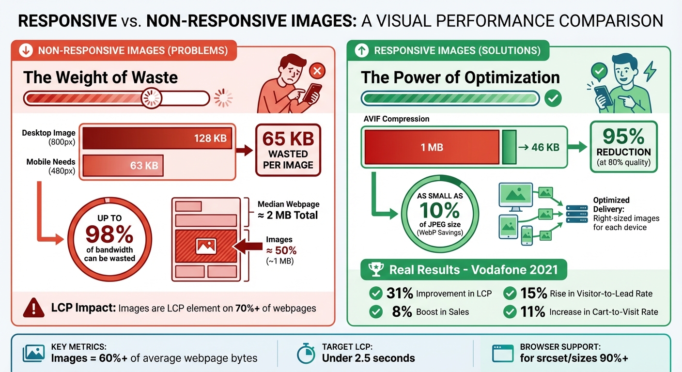
Non-responsive images can create a cascade of issues that harm user experience and lead to increased costs. When the same large image is served to every device, the consequences extend beyond aesthetics, impacting performance and even business outcomes. A desktop-sized image crammed into a mobile display doesn’t just look out of place - it creates inefficiencies that affect everyone involved.
Slow Load Times on Mobile and Desktop
Forcing mobile users to download oversized images wastes bandwidth and slows down page loading. For instance, an 800-pixel image designed for desktops might be 128 KB, while a mobile device with a 480-pixel screen only needs a 63 KB version. That’s 65 KB of unnecessary data for just one image. Multiply this across an entire page, and the waste can quickly add up to hundreds of kilobytes.
But the problem isn’t just about file size. Large images create "bandwidth contention", where oversized files compete with essential resources like CSS and JavaScript for network priority [8, 12]. If images are loaded via JavaScript instead of being defined in the HTML, "request chains" delay downloads until scripts are fully parsed. After downloading, the browser spends extra CPU cycles decoding these oversized images. The result? Slower load times, higher bandwidth usage, and a poor user experience.
High Bandwidth Usage and Costs
Non-responsive images don’t just slow websites - they also drive up costs. As of June 2022, the median webpage transferred around 2 MB of data, with images making up nearly half of that. For users on metered data plans, downloading unnecessary image data can result in higher bills. Similarly, website owners may face increased hosting and egress fees.
To put it in perspective, using an oversized image can waste up to 98% of its bandwidth. Switching to modern formats like AVIF can dramatically reduce file sizes. For example, a 1 MB image can be compressed to just 46 KB at 80% quality - a 95% reduction.
Negative Impact on Core Web Vitals
These technical inefficiencies directly affect Core Web Vitals, particularly the Largest Contentful Paint (LCP), a key performance metric. Images are the LCP element on over 70% of webpages, which means their optimization - or lack thereof - plays a huge role in how fast a site feels to users. Large, unoptimized images delay resource downloads, increasing the LCP and making the page feel sluggish.
The business implications are hard to ignore. In 2021, Vodafone optimized its images and saw a 31% improvement in LCP. This led to an 8% boost in sales, a 15% rise in the visitor-to-lead rate, and an 11% increase in the cart-to-visit rate. Poor image performance doesn’t just frustrate users - it can directly impact conversions and revenue.
"It's no exaggeration to say that optimizing image requests may be the single biggest performance optimization you can make." – web.dev
How Responsive Images Improve Performance
Responsive images address common performance issues by allowing browsers to select the most suitable image for a user's device. Instead of forcing every device to load the same large file, responsive images offer multiple sizes, enabling the browser to choose the best one based on factors like screen size, pixel density, and even network speed. This approach shifts from prescribing a single image to describing multiple options, leaving the optimization to the browser. Let’s explore two key methods for implementing this: using srcset and sizes, and leveraging the <picture> element.
Using Srcset and Sizes for Image Delivery
The srcset and sizes attributes work together to ensure users get the right image for their device. The srcset attribute lists various image versions, each tagged with width descriptors (e.g., 600w for a 600-pixel-wide image) or pixel density descriptors (e.g., 2x for high-resolution screens). Meanwhile, the sizes attribute tells the browser how much screen space the image will occupy, even before CSS fully loads. For instance, (max-width: 600px) 100vw, 50vw means the image will fill the entire viewport width on smaller screens but only half the width on larger ones.
The browser uses this data to select the most appropriate image. It considers factors like screen width, pixel density, zoom level, and network conditions to make a choice. For example, an iPhone with a Retina display (400-pixel-wide screen at 2x resolution) might download a 400-pixel-wide image for a 200-pixel slot, ensuring sharpness without the overhead of an 800-pixel file. This selection happens immediately, allowing the browser to start downloading the image before CSS or JavaScript even loads.
"With
srcset, the browser does the work of figuring out which image is best." – Chris Coyier, CSS-Tricks
The results are tangible. By serving appropriately sized images, you can save significant bandwidth. Modern formats like WebP and AVIF amplify these savings - WebP can be as small as 10% of a JPEG's size, while AVIF can reduce file sizes by over 50% in some cases.
Using the Picture Element for Flexibility
The <picture> element offers a different level of control. While srcset provides suggestions that the browser evaluates, <picture> gives explicit instructions. It’s ideal for two scenarios: art direction (e.g., different crops for various screen sizes) and format switching (e.g., serving modern formats like AVIF or WebP while falling back to JPEG for older browsers).
The <picture> element contains one or more <source> elements with media queries, followed by a required <img> fallback. The browser evaluates each <source> in order and selects the first one that matches. For art direction, you might serve a zoomed-in crop for mobile users and a wide landscape for desktop users, ensuring the subject remains visible. For format switching, you can use the type attribute to deliver AVIF or WebP to modern browsers while older ones default to JPEG.
| Feature | srcset (on <img>) |
<picture> Element |
|---|---|---|
| Primary Purpose | Resolution switching (same image, different sizes) | Art direction and format switching |
| Browser Logic | Provides "suggestions"; browser chooses based on heuristics | Provides "commands"; browser follows media/type rules |
| Use Case | High-DPI displays and fluid layouts | Cropping for mobile or serving AVIF/WebP |
While the <picture> element is more complex and requires additional maintenance, it offers precise control when needed. Always include the <img> element as the last child within <picture> to ensure compatibility with older browsers.
Reducing Bandwidth and Improving Load Times
Both srcset and the <picture> element work to minimize file sizes and speed up loading. By eliminating oversized images, these techniques reduce bandwidth usage and prevent mobile devices from downloading unnecessarily large desktop files.
Smaller files mean faster downloads, quicker decoding, and less competition with other critical resources like CSS and JavaScript. Since images heavily influence metrics like Largest Contentful Paint (LCP), optimizing them enhances Core Web Vitals scores and makes your site feel faster for users. The browser's preload scanner can even identify and start fetching responsive images early - before CSS or JavaScript is fully parsed - ensuring the right image begins downloading almost immediately.
"The
sizesattribute is about speed. It gives the browser enough information to make a smart choice as soon as it sees your<img>." – Geoff Graham, CSS-Tricks
How to Implement Responsive Images
You can implement responsive images using straightforward HTML. There's no need for complicated JavaScript or server-side solutions - everything is handled with standard HTML attributes that over 90% of browsers support.
Using Srcset and Sizes Attributes
The srcset and sizes attributes turn a simple <img> tag into a responsive powerhouse. Start by creating multiple image versions (e.g., 400px, 800px, 1200px, and 1600px wide). Then, use the following syntax:
<img
  src="hero-800.jpg"
  srcset="hero-400.jpg 400w,
          hero-800.jpg 800w,
          hero-1200.jpg 1200w,
          hero-1600.jpg 1600w"
  sizes="(max-width: 600px) 100vw,
         (max-width: 1200px) 50vw,
         800px"
  alt="Product showcase"
  width="1600"
  height="900">
Here’s how it works:
srcset: Lists the image files, each paired with its width descriptor (w), which tells the browser the intrinsic width of each file.sizes: Acts as a guide, describing how much screen space the image will occupy. The browser evaluates the conditions in order and picks the first match.
For example:
- Screens under 600px display the image at full viewport width (
100vw). - Screens between 600px and 1200px show the image at half the viewport width (
50vw). - Larger screens default to a fixed 800px width.
The width and height attributes are also crucial - they reserve space on the page before the image loads, preventing awkward layout shifts.
If your layout includes sidebars or margins, you can use calc() in the sizes attribute to adjust for those elements. For example: sizes="(min-width: 800px) calc(100vw - 200px), 100vw".
"The sizes attribute tells the browser how wide the image will be when it's displayed, though it doesn't affect the image's display size, so you still need CSS for that." – Katie Hempenius, Software Engineer, Google
For even more control, you can use the <picture> element.
Using the Picture Element
If you need advanced options - like delivering different image crops for mobile and desktop or using modern formats such as AVIF and WebP - the <picture> element is your go-to tool. Unlike srcset, which offers suggestions, <picture> gives the browser explicit instructions.
For format switching, list the sources in order of preference, starting with the most modern format:
<picture>
  <source type="image/avif" srcset="hero.avif">
  <source type="image/webp" srcset="hero.webp">
  <img src="hero.jpg" alt="Product showcase" width="1600" height="900">
</picture>
The browser will use the first <source> it supports. The <img> tag serves as both a fallback and the rendering target.
For art direction, the media attribute allows you to serve different image crops based on screen size:
<picture>
  <source media="(max-width: 600px)" srcset="hero-mobile-crop.jpg">
  <source media="(min-width: 601px)" srcset="hero-desktop-wide.jpg">
  <img src="hero-desktop-wide.jpg" alt="Product showcase" width="1600" height="900">
</picture>
This technique ensures the image looks great on all devices. For instance, you can display a zoomed-in crop on mobile while showing a wide landscape on desktop. Remember to include the alt attribute on the <img> tag - it applies no matter which source the browser selects.
Measuring Performance Improvements
Responsive images do more than just enhance performance - they provide measurable results. Tracking these improvements ensures your optimization efforts are effective. Once you've implemented responsive images, it's time to assess their impact.
Auditing Website Performance With dCLUNK™
dCLUNK™ by CLUNKY.ai is a performance auditing tool designed to pinpoint bottlenecks, including image-related delays that can slow down your site. It evaluates your Largest Contentful Paint (LCP) element - which is an image on over 70% of webpages - and breaks down LCP sub-timings to uncover potential slowdowns.
The audit also checks that mobile devices aren’t being served oversized desktop images, verifies the use of modern image formats like WebP or AVIF, and measures Cumulative Layout Shift (CLS). By ensuring your images have defined width and height attributes, you can reserve space during rendering and avoid layout shifts.
For a hands-on approach, you can use the Network panel in your browser's DevTools to ensure the correct image version from your srcset is being fetched for the current viewport. Open Chrome or Firefox DevTools, navigate to the Network tab, reload the page, and confirm the downloaded image version. These insights help you focus on the right performance metrics.
Key Metrics to Monitor
Certain metrics highlight the success of responsive image implementation, including LCP, CLS, bandwidth savings, and resource load duration.
Largest Contentful Paint (LCP): Aim for an LCP score under 2.5 seconds for at least 75% of visits. Responsive images improve LCP by reducing the "Resource Load Duration" - the time it takes to transfer image data. For instance, Vodafone achieved a 31% improvement in LCP through technical optimizations, which led to an 8% rise in sales, a 15% increase in visitor-to-lead conversions, and an 11% boost in cart-to-visit rates.
Cumulative Layout Shift (CLS): This metric captures visual stability. Properly defined image dimensions prevent unexpected layout shifts during loading, keeping your CLS score within the "good" range.
Bandwidth and Byte Savings: With images making up over 60% of the bytes required to load an average webpage, even small improvements in image delivery can significantly reduce bandwidth usage.
Resource Load Duration: This measures the time it takes for image assets to download. Shortening this duration frees up bandwidth for other critical resources.
To further refine your site's performance, run Lighthouse Audits to flag oversized images - those whose file sizes exceed their rendered size by at least 4KiB. Additionally, use the Chrome UX Report to analyze real-user data across various devices and network conditions. Regular audits like these ensure your image delivery remains optimized, reinforcing the performance gains you've achieved.
Conclusion
Key Takeaways
Responsive images address common performance issues that can slow websites and frustrate users. By delivering images in the correct size, you can cut down on unnecessary data usage and speed up your site. The combination of the srcset and sizes attributes simplifies resolution switching, while the <picture> element gives you more control over art direction and supports modern image formats.
The performance benefits are clear and measurable. When implemented correctly, responsive images reduce resource load times and improve metrics like Largest Contentful Paint (LCP). Considering that images make up over 60% of the data required to load an average web page, optimizing image delivery can lead to noticeable speed improvements that users will appreciate immediately.
These optimizations not only enhance performance but also improve the overall user experience. High-DPI displays get crisp, detailed visuals, while standard screens avoid downloading extra pixels they don’t need. Defining image dimensions stabilizes layouts, preventing disruptive shifts as content loads. The result? Better engagement, higher conversion rates, and fewer visitors leaving your site prematurely.
Next Steps for Implementation
Here’s how you can start integrating responsive images into your website to enjoy these benefits:
- Audit your site: Use tools like dCLUNK™ from CLUNKY.ai to identify oversized images and measure their impact on performance. This will help you pinpoint areas slowing down your LCP and consuming excessive bandwidth.
- Optimize key images: Create multiple sizes for important images and use
srcsetwithsizesattributes to handle resolution switching. For cases requiring art direction or modern formats like WebP or AVIF, implement the<picture>element with appropriate fallbacks. - Apply attributes for efficiency: Add
loading="lazy"to images below the fold to defer loading until needed. Usefetchpriority="high"for hero images to ensure they load quickly. - Monitor and refine: Perform regular audits to track performance improvements and make adjustments as needed.
FAQs
How do responsive images help websites load faster?
Responsive images help websites load faster by adjusting images to fit a user’s specific device and screen size. This approach cuts down on unnecessary data transfer, reducing bandwidth usage and speeding up load times.
When implemented, responsive images can boost website performance, improve user experience, and even contribute to better SEO rankings. They allow visitors to enjoy sharp, high-quality visuals without compromising site speed.
How does the <picture> element improve website performance with responsive images?
The <picture> element is a handy tool for improving website performance by letting developers serve images tailored to specific devices and conditions. With <source> elements and media queries, it allows you to define multiple image sources. This ensures the most suitable image is loaded based on factors like screen size, resolution, or supported formats. It's particularly helpful for art direction, such as showing cropped or differently formatted images on various devices.
By serving images optimized for the user's device, the <picture> element minimizes bandwidth usage and speeds up load times. This can boost key performance metrics like Largest Contentful Paint (LCP) and overall page speed, both of which are essential for a smooth user experience. Plus, it includes a fallback mechanism for older browsers, ensuring broad compatibility. Leveraging the <picture> element is a practical way to improve both the look and performance of your website.
How do I track performance improvements after using responsive images?
To measure how well your site performs after adding responsive images, keep an eye on metrics like page load times, Largest Contentful Paint (LCP), and bandwidth usage. Responsive images can speed up load times and improve LCP, making sure your key content shows up faster for visitors.
Tools like Lighthouse or other performance auditing software are great for tracking these metrics. Compare results from before and after the changes. Pay attention to areas like correctly sized images, lower data consumption, and quicker rendering. Watching these metrics closely will give you a solid understanding of how responsive images boost your site's performance.
Explore the six basics
Every Clunky AI article maps back to one or more of the questions a business site has to answer.
Related Posts
Tags PerformanceResponsive DesignUser Experience
Category Website Optimization