How Layout Impacts Visual Hierarchy in UX
1/19/2026 • 14 min read
How Layout Impacts Visual Hierarchy in UX
Clear layouts make websites easier to use. A good layout helps users focus on key information, follow a logical path, and complete actions quickly. Poor layouts? They create confusion and frustration.
Here’s what matters most:
- Visual hierarchy: Guides users to what’s important first.
- Grid systems: Keep designs organized and aligned.
- Whitespace: Reduces clutter and improves readability.
- Responsive design: Ensures usability across devices, especially mobile (now 60%+ of web traffic).
How to Use Information Hierarchy for UX & UI Design
Using Grid Systems to Create Structure
Grid systems act as the backbone of your layout, bringing organization and structure to your design. At their core, grids are made up of columns (vertical sections where content is placed), gutters (the spaces between columns), and margins (the outer buffer between your content and the screen's edge). These elements work together to ensure alignment and create a sense of order across your interface.
"The grid is an integral part of book design, it's not something that you see. It's just like underwear: you wear it, but it's not to be exposed. The grid is the underwear of the book."
- Massimo Vignelli, Designer
Grid-Based Design Basics
A standard column grid divides a page into 12 columns, offering flexibility since 12 can be evenly split into halves, thirds, quarters, and sixths. For layouts that require more complexity - like e-commerce platforms or photo galleries - a modular grid introduces horizontal rows, forming a matrix of cells to control both vertical and horizontal placement. If your content varies in importance, a hierarchical grid uses uneven spacing to ensure the most critical elements take up the most prominent screen areas.
Modern grids often follow the 8px rule, where all grid components and spacing are set in multiples of 8 pixels. This rule aligns with most screen resolutions, making it easier to scale designs across devices. To maintain visual clarity, always place content within the columns and leave the gutters empty, as these spaces are crucial for separating elements.
Why Consistent Grids Matter
Grids make interfaces predictable, helping users process visual information quickly and with less effort. Studies show that users form an impression of a website's visual appeal in just 50 milliseconds, highlighting the importance of a consistent grid for creating a strong first impression. Additionally, grids simplify teamwork by aligning with CSS frameworks like Flexbox or CSS Grid, which developers can use to mirror the design's column structure.
"The grid system is an aid, not a guarantee. It permits a number of possible uses and each designer can look for a solution appropriate to his personal style. But one must learn how to use the grid; it is an art that requires practice."
- Josef Müller-Brockmann, Graphic Designer
A well-thought-out grid is also adaptable. Using breakpoints, your layout can shift to fit different screen sizes. For example, a 12-column grid on a desktop might condense to a 4-column grid on mobile, ensuring usability and preserving the visual hierarchy. This responsiveness keeps your design functional and appealing across devices. Up next, we'll explore how the placement and proximity of elements can further enhance visual hierarchy.
Element Placement and Proximity Principles
A well-structured grid lays the foundation for your layout, but it's the deliberate placement of elements that truly defines the visual flow and hierarchy of your design.
How you position elements can shape how users understand and interact with your interface. By applying the proximity principle - keeping related elements close together - you can ease cognitive load and guide users toward important actions.
Using Scanning Patterns
Positioning elements to align with natural scanning patterns ensures they grab attention right away. Users tend to scan pages in predictable ways. On text-heavy pages, like articles or search results, the F-Pattern dominates. Here’s how it works: users first sweep horizontally across the top of the page, then move down the left margin, making shorter horizontal scans as they go. This is why headlines and left-aligned keywords tend to stand out the most.
For simpler layouts, such as landing pages or hero sections, the Z-Pattern is more effective. In this pattern, the eye moves from the top-left corner (often the logo) to the top-right (navigation), then diagonally down to the bottom-left, and finally across to the bottom-right. This makes the bottom-right corner an ideal spot for your primary call-to-action.
"Visual hierarchy is simply the ordering of visual elements so people see what matters first - and it's the difference between an interface that converts and one that confuses."
- Robin Dhanwani, Founder, Parallel
It’s also important to consider tunnel vision, which occurs when users are so focused on completing a task that they overlook elements outside their immediate area of focus. For instance, secondary options like “Skip” or “Details” can go unnoticed if placed too far from the main action.
Grouping and Spacing for Clarity
Understanding how users scan a page highlights the importance of grouping and spacing. Keeping related elements together - like placing a label directly above its input field - creates a clear relationship without needing extra visual dividers. On the other hand, adding more space between unrelated groups signals their distinct purposes.
This technique is especially useful in forms. Breaking a long form into smaller, grouped sections makes it less intimidating and easier to complete. For example, dividing a 12-field form into three logical groups helps users focus on one section at a time. The spacing between these groups acts as a natural pause, making the process feel less overwhelming. In fact, one B2B SaaS product saw a 20% increase in sign-ups after adding more padding around onboarding steps.
On mobile devices - where over 60% of global web traffic originates - proximity relationships can get tricky when side-by-side columns stack vertically. To maintain clarity, ensure that grouped elements remain visually connected even when the layout adapts to smaller screens. A quick squint test - blurring your design to check if groupings are still obvious - can help confirm whether your spacing works across all devices.
Whitespace and Spacing as Design Tools
Whitespace isn’t just empty space - it’s a design tool that guides attention, reduces clutter, and makes information easier to digest. When used thoughtfully, spacing acts as a visual roadmap, simplifying even the most complex content.
There are two types of whitespace to consider. Macro whitespace refers to the larger gaps between sections, which help structure your layout and provide breathing room. Micro whitespace, on the other hand, includes the smaller gaps between lines, letters, or items, improving readability. Together, they prevent your design from feeling cramped or overwhelming.
"Whitespace is to be regarded as an active element, not a passive background."
- Jan Tschichold, Calligrapher and Typographer
Take Google’s homepage as an example. Its use of macro whitespace eliminates distractions, focusing attention on the search bar. This simplicity reduces the mental effort required to get started. Similarly, Apple’s product pages use negative space to create a sense of elegance and ensure that high-quality visuals remain the focal point.
Reducing Cognitive Load with Spacing
Strategic spacing does more than make your design look clean - it helps users process information in smaller, more manageable chunks. Studies show that proper use of whitespace can boost reading comprehension by up to 20%. It also improves usability; for example, padding around buttons creates larger tap targets, reducing accidental clicks and user frustration.
Whitespace also influences user behavior. Surrounding a call-to-action (CTA) button with extra space naturally draws attention to it, making it stand out without relying on flashy colors or oversized fonts. This subtle use of spacing can increase click-through rates by up to 20%.
For readability, aim to keep line spacing (leading) between 1.5 to 2 times your font size, or between 120% and 145% of the point size. On desktops, use margins of 40–60 pixels between major elements. For mobile layouts, adjust to 20–30 pixels to account for smaller screens while maintaining clarity.
Balancing Whitespace in Limited Space
Designing for mobile screens can be tricky. You need enough spacing to avoid visual clutter, but you also can’t afford to push important content below the fold. This is where micro whitespace shines. Small gaps between text lines, list items, and buttons can maintain clarity without wasting precious screen real estate.
An 8-point spacing system can help you create consistent and predictable spacing across devices. This approach establishes a natural rhythm that feels intuitive to users. For tighter layouts, consider tools like progressive disclosure - using accordions, tabs, or "read more" links to hide less critical details while keeping key content accessible.
Here are the key types of whitespace to keep in mind:
- Micro Whitespace: Improves readability and legibility.
- Macro Whitespace: Structures the overall layout.
- Active Whitespace: Highlights important elements, like CTAs.
- Passive Whitespace: Prevents crowding and clutter.
It’s worth noting that 94% of a user’s first impression of a website is design-related. When too many elements compete for attention, nothing stands out. Whitespace ensures that your most important features get the attention they deserve. By giving your design room to breathe, you help users focus on what really matters. This approach pairs perfectly with responsive design techniques, setting the stage for seamless usability across devices.
sbb-itb-641714f
Responsive Layouts for Multi-Device Usability
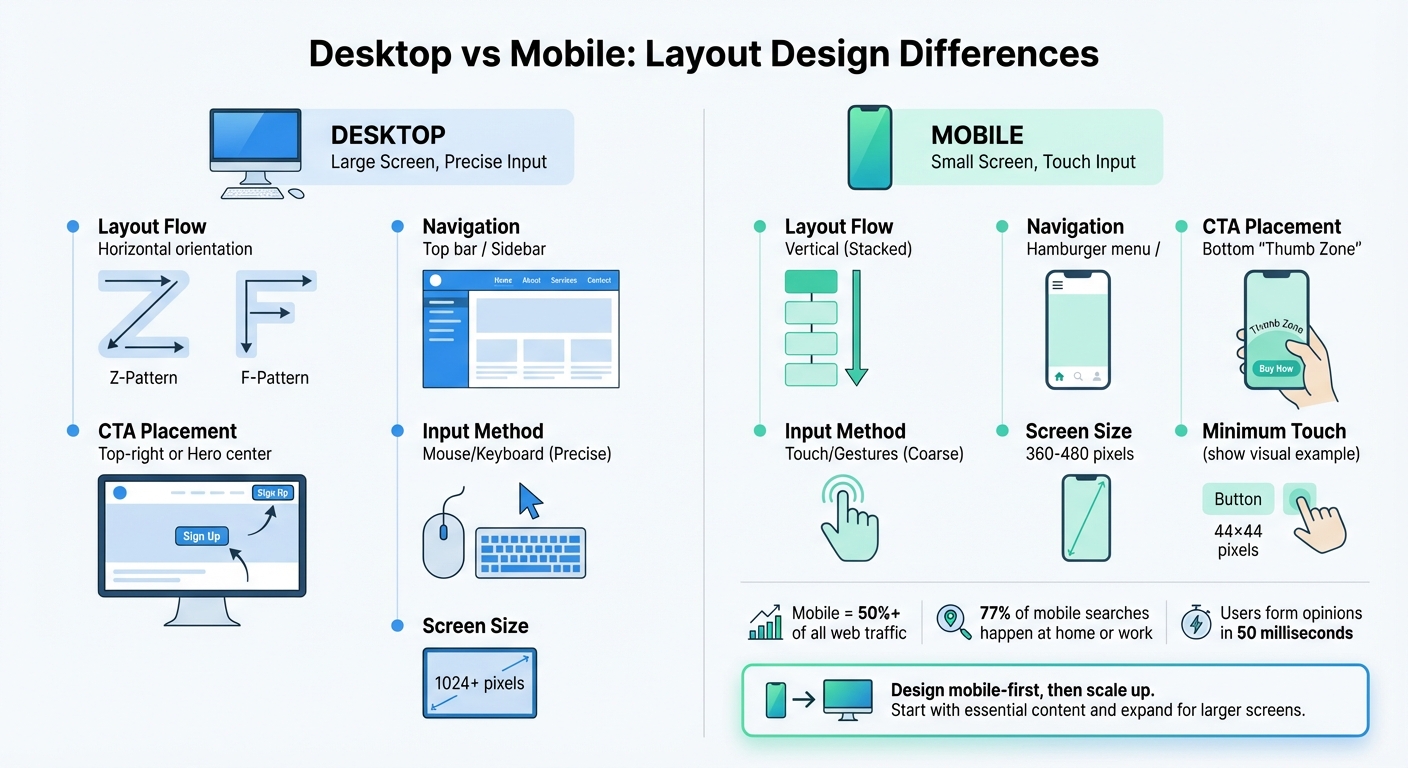
Desktop vs Mobile Layout Design: Key Differences in Visual Hierarchy
Your website’s visual hierarchy doesn’t take a break when users switch from desktops to smartphones. With mobile traffic now accounting for over 50% of all web visits, your design must adapt to smaller screens while still guiding users effectively. The challenge lies in maintaining clarity and focus when screen space is limited, which requires rethinking how layout elements function on smaller devices.
Responsive design isn’t optional anymore - it’s essential. Frank Spillers, CEO of Experience Dynamics, puts it simply: "Responsive is a default. Responsive is not an option – do it". To achieve this, use fluid grids that resize proportionally and container queries that adapt components based on their immediate boundaries. This ensures your visual hierarchy remains intact, whether it’s viewed on a widescreen monitor or a compact smartphone.
Adjusting Hierarchy for Smaller Screens
Designing for smaller screens means focusing on what’s truly important. A mobile-first approach - starting with the smallest screen and scaling up - forces you to prioritize essential content and functionality rather than cramming desktop elements into a smaller space.
Mobile layouts often shift to a single-column, vertical flow, making it crucial to place primary CTAs (call-to-actions) in the "thumb zone" at the bottom of the screen, where they’re easy to reach with one hand. Scanning patterns also change; users move from horizontal layouts like Z-patterns or F-patterns to a more straightforward vertical arrangement. To ensure touch accuracy, make interactive elements at least 44×44 pixels.
Use progressive disclosure to simplify the interface by hiding secondary content in hamburger menus, tabs, or accordions. This keeps the main focus clear without overwhelming users. And since 77% of mobile searches happen at home or work, consistency across devices is critical.
Creating Flexible Layouts
Building on mobile-friendly hierarchies, flexible layouts rely on relative units like percentages or fr instead of fixed pixels, allowing elements to resize gracefully across different screen sizes. For typography, CSS functions like clamp(), min(), and max() help scale text dynamically between defined minimum and maximum sizes without requiring multiple breakpoints. This approach ensures your typographic hierarchy stays consistent across devices.
Plan for at least three to five breakpoints to maintain layout integrity: around 360–480 pixels for mobile, 768 pixels for tablets, and 1,024+ pixels for desktops. Use SVGs for icons and logos to keep them sharp on any screen resolution. An 8-point spacing system can create a sense of consistency and rhythm, making your design feel intuitive even when elements stack or reflow.
| Design Element | Desktop | Mobile |
|---|---|---|
| Layout Flow | Horizontal (Z/F-patterns) | Vertical (Stacked) |
| Navigation | Top bar / Sidebar | Hamburger menu / Bottom nav |
| CTA Placement | Top-right or Hero center | Bottom "Thumb Zone" |
| Input Method | Mouse/Keyboard (Precise) | Touch/Gestures (Coarse) |
Here’s a simple trick to test your responsive hierarchy: try the squint test. Blur your vision or apply a 5–10 pixel blur to your design preview. Can you still identify the most important elements? If not, you may need to refine your layout. Remember, users form an opinion about a website in just 50 milliseconds, so your design must make a strong first impression on every screen size.
Evaluating and Improving Your Layout
Once you've nailed responsive design and clear element placement, the next step is regularly evaluating your layout. Even the best designs can benefit from periodic reviews. A quick audit using the right tools can help you catch and fix potential issues before they become larger problems.
Common Layout Mistakes to Avoid
One of the biggest culprits in poor layouts is overcrowding. When too many elements vie for attention, users can feel overwhelmed, unsure where to focus. This creates visual noise and fatigue, making the experience frustrating for users. Robin Dhanwani, Founder of Parallel, explains, "When hierarchy is missing, cognitive load rises and drop‑off increases". Another common issue? Text hierarchy. If headings aren't at least 2–3 times larger than body text, the page can feel flat, making it harder for users to scan and engage.
Misalignment and uneven spacing are other frequent offenders. They create a sense of disarray, making it tough for users to connect related content. Stick to a consistent system, like an 8-point grid, to ensure a balanced rhythm throughout your design. And don't forget about "banner blindness." Poor content grouping can lead users to ignore important information, especially if it's placed in areas typically associated with ads, like sidebars. As Kelley Gordon from Nielsen Norman Group aptly puts it, "If everything is contrasted, then nothing stands out". To avoid this, limit emphasis to three to five levels so that key elements can shine without overwhelming the user.
Tools for Layout Analysis
Start simple with the squint test. Step back, squint at your design, or apply a 5–10 pixel blur to a screenshot. The most important elements should still stand out. This low-tech method quickly reveals if your visual groupings are working as intended.
For a more in-depth analysis, tools like CLUNKY.ai's dCLUNK™ can scan your website to flag UX, performance, and accessibility issues while offering actionable suggestions to improve your layout's hierarchy. These insights ensure your design effectively guides user attention. Plus, the scans are free, making it easy to perform regular audits. Combine this with tools like Hotjar heatmaps and Chrome DevTools to spot where your hierarchy might break down across different devices.
Take inspiration from real-world examples. In 2025, Parallel HQ revamped a data-heavy dashboard for an AI analytics tool by increasing the size of the main performance metric by 40% and implementing a clear typographic scale. The result? Users could instantly focus on key trends upon landing. In another case, they simplified the onboarding flow for a B2B SaaS product by adding generous padding and refining the visual hierarchy. This led to a 20% boost in sign-ups and fewer support tickets. These examples highlight how regular layout evaluations not only enhance user experience but also drive measurable business results. By aligning your design with evolving goals, you ensure your layout stays effective and impactful.
Conclusion
Layout is more than just arranging elements on a page - it’s about leading users through content with purpose. Thoughtful decisions around size, color, spacing, and placement create a clear path that guides user actions seamlessly. By understanding and applying core layout principles - like grids, spacing, and hierarchy - you can craft designs that feel intuitive and engaging.
"The best designs are the ones that don't make you think too hard. They simply guide you, quietly and deliberately, like a good story should".
- Lacey Meehan, Senior Art Director at Liquid
The principles we've discussed - grid systems for structure, proximity for grouping, whitespace for breathing room, and responsive layouts for multi-device usability - work together to make interfaces easy to navigate. These elements reduce cognitive load, turning complex designs into scannable, user-friendly experiences. Remember, users form opinions in just milliseconds. That’s why every design choice, from the size of headings (2–3 times larger than body text) to the contrast of CTAs, plays a critical role in building trust and encouraging interaction.
The difference between a chaotic interface and one that feels effortless lies in hierarchy. Without it, users face visual clutter and frustration, leading to higher bounce rates and incomplete tasks. With it, you create a sense of order that fosters clarity and satisfaction. As Clay puts it, "Visual hierarchy turns chaos into clarity".
To keep your designs sharp, use tools like the squint test and CLUNKY.ai's dCLUNK™ for spotting UX issues and getting actionable feedback. Given that mobile now accounts for over 60% of global web traffic, designing with intention is more important than ever. By regularly evaluating your layouts and aligning them with user needs and business goals, you can transform functionality into an exceptional user experience.
FAQs
How does using a grid system improve visual hierarchy in UX design?
Grids offer a structured framework made up of invisible columns, gutters, and margins that help organize content seamlessly. By aligning elements to this framework, designers can manage placement, spacing, and size with precision. This ensures that key features - like headings or calls-to-action - stand out, while less critical content takes a backseat. The result? A layout that guides users effortlessly, making it easier to scan and prioritize information.
Another benefit of grids is their ability to maintain consistency across various screen sizes. This adaptability reinforces the visual hierarchy, no matter what device someone is using. Tools like CLUNKY.ai can step in to analyze your site's layout, pinpoint alignment issues, and suggest tweaks to ensure your grid delivers a clean and user-friendly experience.
How does whitespace improve visual hierarchy and user experience?
Whitespace, often called negative space, refers to the empty areas surrounding and between elements on a page. While it might seem like "nothing", it plays a huge role in reducing clutter and making content easier to read and navigate. By strategically using whitespace, you can group related elements, draw attention to key features, and naturally guide users through the content.
When done right, whitespace not only improves usability but also gives a layout a clean, polished look. For instance, adding space around headings, buttons, or images makes them stand out and boosts readability. It also encourages users to interact with the content. Tools like CLUNKY.ai's dCLUNK™ scanner can help teams pinpoint where whitespace could be improved, ensuring designs are both functional and visually pleasing.
Why is responsive design important for keeping visual hierarchy consistent across devices?
Responsive design ensures a website’s layout adjusts smoothly to fit various screen sizes, orientations, and resolutions - whether it’s a large desktop monitor or a compact smartphone. By leveraging tools like media queries and using flexible units like percentages, em, or rem, designers can maintain the visual hierarchy of headings, images, buttons, and other key elements, ensuring they stay in the right order of importance no matter the device.
Visual hierarchy is all about guiding the user’s attention to the most critical content first. It uses elements like size, contrast, spacing, and placement to create a natural flow. Without responsive design, these cues can fall apart on smaller screens, making important information harder to spot and leaving users frustrated. A thoughtfully crafted responsive layout tweaks typography, spacing, and element positioning to keep the hierarchy clear and easy to follow, regardless of the device.
For teams aiming to refine their layouts, CLUNKY.ai’s dCLUNK™ tool can be a game-changer. It evaluates websites for layout, usability, and accessibility issues across different devices, offering practical insights to enhance visual hierarchy and user experience.
Explore the six basics
Every Clunky AI article maps back to one or more of the questions a business site has to answer.
Related Posts
Tags AccessibilityResponsive DesignUser Experience
Category Website Optimization