How Micro-Interactions Boost User Engagement
11/18/2025 • 15 min read
How Micro-Interactions Boost User Engagement
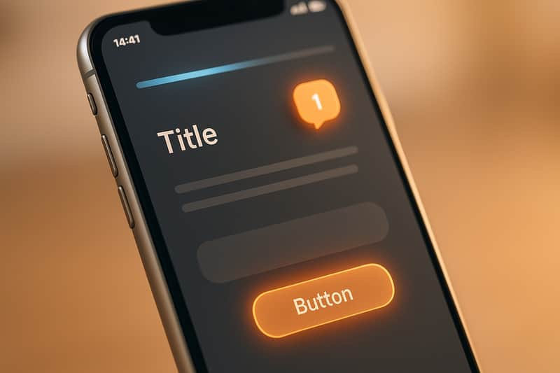
Micro-interactions are small design elements that make digital experiences smoother and more enjoyable. Think of a button changing color when clicked, a tooltip appearing on hover, or a progress bar showing task completion. These subtle details reassure users, reduce confusion, and create a sense of control.
Key takeaways:
- What they do: Provide feedback, guide actions, and add personality to interfaces.
- Examples: Button animations, hover effects, real-time form validation, and loading indicators.
- Why they matter: Improve user confidence, simplify navigation, and encourage engagement.
- Impact: Companies like Attention Insight increased activation rates by 47% with progress bar micro-interactions.
To integrate micro-interactions effectively:
- Identify key moments in the user journey (e.g., navigation, forms, or loading states).
- Use tools like CSS or JavaScript for implementation.
- Test for usability and accessibility to ensure they work for all users.
Tracking metrics like conversion rates, bounce rates, and click-through rates helps measure success. Tools like CLUNKY.ai can pinpoint areas for improvement, ensuring micro-interactions enhance the user experience without creating friction.
Micro Interactions in UX | Importance and Examples of Micro Interactions
What Are Micro-Interactions and Why Do They Matter?
Micro-interactions add a human touch to digital interfaces by providing immediate, precise feedback to user actions on websites and apps. Whether you're hovering over a button, submitting a form, or waiting for a page to load, these small, purposeful responses make the experience feel natural and intuitive.
Here are a few common examples:
- Button animations: Think of color changes or ripple effects when you click a button.
- Hover effects: Tooltips appearing or images zooming in when you move your mouse over them.
- Loading indicators: Spinning icons or progress bars that show something is happening in the background.
- Real-time feedback: Examples include form validation that flags errors as you type, animated notification badges updating counts, or typing indicators in chat apps.
What makes micro-interactions stand out is their focus on specific moments. Unlike larger design elements like navigation menus or hero sections that serve broader purposes, micro-interactions are like digital nods - they acknowledge your actions, showing that they matter.
How Micro-Interactions Improve User Experience
Micro-interactions act as a bridge between users and technology, confirming actions in real time and reducing confusion. For instance, when you click a button and see it respond immediately, you know your input was registered. This removes any guesswork and minimizes frustration.
A great example is Google's Material Design, which uses ripple animations on buttons. These subtle effects provide instant feedback, helping users feel confident that the interface is working as expected.
Micro-interactions also serve as helpful guides. For example, tooltips can clarify the purpose of unfamiliar icons, progress bars show how much of a process is complete, and hotspots highlight key features during onboarding. Together, these details reduce mental effort and make interfaces more accessible.
Another practical use is in form validation. Instead of waiting for users to submit a form before flagging errors, micro-interactions offer real-time feedback. For example, they might display a red border and error message for an invalid email or a green checkmark for a correct entry.
Why Micro-Interactions Drive Engagement
When done well, micro-interactions create small moments of joy that make users want to come back. They turn everyday tasks into enjoyable experiences, leaving users feeling rewarded and appreciated. This positive emotional response can even enhance how users perceive the entire product or service - a phenomenon often referred to as the "halo effect".
Take Facebook's reaction feature, for example. By letting users tap and hold the like button to choose from a range of emotive responses, Facebook has increased interaction rates and deepened emotional engagement.
Other examples include:
- Slack, which uses playful loading messages and animations to make waiting more enjoyable while reflecting its brand personality.
- Nike's mobile app, which celebrates workout milestones with animations, encouraging users to stay motivated and engaged.
At their core, micro-interactions help users feel acknowledged and in control. This sense of empowerment can lead to longer sessions, more frequent visits, and higher conversion rates - proving that even the smallest details can have a big impact on business outcomes.
Next, let’s dive into five specific types of micro-interactions that can elevate engagement even further.
5 Types of Micro-Interactions That Boost Engagement
Let’s explore five types of micro-interactions that can make a big impact on user engagement. Each one serves a specific purpose, addressing user needs and moments of uncertainty while creating a smoother, more intuitive experience. These small but powerful touches not only clarify actions but also improve navigation and overall satisfaction.
Hover Effects for Clear Navigation
Hover effects are a simple way to guide users and eliminate confusion by showing which elements are interactive. A great example is Hootsuite’s magnetic cards, which slightly “jump” when hovered over, signaling interactivity. These effects go beyond basic color changes - think size adjustments, shadows, tooltips, or subtle animations. They’re especially effective for call-to-action buttons, navigation menus, and product cards on e-commerce sites, helping users quickly scan and interact with content.
Button Animations for Action Confirmation
Button animations provide immediate feedback, reassuring users that their actions have been registered. Google’s Material Design, for instance, uses ripple effects that originate from the point of contact, mimicking the feel of pressing a physical button. Whether it’s through a color shift, a slight depression, or rippling animations, these visual cues confirm actions like form submissions or purchases without causing any delays.
Scroll-Triggered Animations for Content Highlighting
Scroll-triggered animations are a dynamic way to guide users through content. Apple’s iPhone 16 landing page is a standout example, revealing features one at a time as users scroll, making the information more digestible and engaging. These animations can highlight key sections, showcase statistics, or introduce product features through fades, slides, or other transitions, seamlessly supporting the narrative.
Loading Indicators to Manage User Expectations
Loading indicators turn wait times into clear, manageable moments. Slack’s clever loading messages, for example, add personality to delays, keeping users entertained while they wait. From progress bars to spinning icons and percentage displays, these indicators set expectations about how long a process will take. Quick tasks benefit from simple animations, while more complex processes - like Google Maps loading stages - use detailed progress updates to keep users informed.
Microcopy for User Guidance and Support
Microcopy - those small bits of text that guide users during interactions - can make a huge difference in reducing frustration and improving task completion. Real-time form validation, for example, gives immediate feedback, helping users fix errors as they type. Friendly error messages explain what went wrong and how to resolve it. Grammarly takes this a step further during onboarding, using small flashing icons (hotspots) to highlight features and guide users through the next steps. Paired with visual feedback, like checklists that increased activation rates by 47%, well-crafted microcopy ensures a smoother, more intuitive experience.
When thoughtfully incorporated, these micro-interactions can transform a website into a more engaging, user-friendly space. The key lies in identifying the right moments to integrate these elements, ensuring they enhance the overall experience without overwhelming the user.
How to Add Micro-Interactions to Your Website
Adding micro-interactions to your website can make a big difference in how users experience your site. These small, purposeful design elements can provide feedback, guide users, and make interactions feel more intuitive. By following a structured approach, you can identify where these interactions are most needed, implement them effectively, and fine-tune them to enhance usability.
Find Key User Touchpoints
Start by mapping out your user journey to pinpoint moments where micro-interactions can improve clarity or engagement. For example:
- Navigation menus: Add feedback for clickable elements to reduce uncertainty.
- Form submissions: Use confirmation messages to reassure users their input was received.
- Loading states: Include indicators to show progress and assure users the system is working.
- Error messages: Offer guidance to help users resolve issues.
- Completion moments: Celebrate actions like successful purchases or sign-ups with subtle animations.
Analytics can also help you find problem areas. For instance, if your checkout process has a high drop-off rate, consider adding progress indicators or real-time validation to guide users through each step. Similarly, decision points like call-to-action (CTA) buttons are critical. A confusing or unengaging CTA can hurt conversions. Adding hover effects or animations can make these buttons more intuitive and inviting.
Once you've identified these touchpoints, you can choose the best design methods to bring your ideas to life.
Select the Right Tools and Design Methods
With your key touchpoints in mind, decide how to implement your micro-interactions. For simple effects like hover animations or transitions, CSS is often enough. However, for more complex interactions - like scroll-triggered animations or dynamic feedback systems - you'll need JavaScript. Frameworks like React or Vue.js are especially helpful for creating smooth, responsive interactions.
Before diving into development, use design tools like Figma or Adobe XD to prototype and test your ideas. These tools allow you to experiment with timing, motion, and visual effects to ensure the interactions align with your brand’s personality. For example, Slack incorporates playful animations and clever loading messages to reflect its friendly, approachable vibe. Every micro-interaction should feel like a natural extension of your brand.
By combining the right tools with thoughtful design, you can create interactions that genuinely enhance user engagement.
Test and Improve for Usability and Accessibility
Once your micro-interactions are live, it’s time to test their effectiveness. Conduct user testing with a diverse group of participants to ensure your interactions are intuitive and helpful. Testing prototypes or staging versions of your site can reveal areas where users might get confused.
Accessibility testing is equally important. Make sure your interactions work seamlessly with screen readers by adding proper ARIA labels. Provide keyboard navigation alternatives for hover effects, avoid relying solely on color or motion to convey information, and include descriptive text for elements like loading indicators.
Gather feedback through A/B testing and track metrics like click-through rates, bounce rates, and conversion rates. This data will help you identify which interactions are working and which need improvement.
Tools like CLUNKY.ai’s dCLUNK™ can simplify the process by scanning your site for usability, performance, and accessibility issues. For example, ShopHive used CLUNKY.ai to address friction in their user flow, leading to a 24% increase in trial conversions. As their Growth Lead, Avery G., shared:
"We were stuck at a 1% signup rate until the CLUNKY AI crew flagged friction in our flow. After implementing their fixes, our trial conversions jumped 24%."
Similarly, SaaSify improved demo requests by 18% after fixing accessibility issues highlighted during testing. Marketing Director Rhea S. explained:
"Our site felt fine, but their report showed accessibility gaps hurting trust. With CLUNKY AI's guidance, demo requests climbed 18% overnight."
The key to success is continuous improvement. Launch your initial micro-interactions, gather feedback, analyze performance, and refine your designs. Regular updates ensure your micro-interactions remain effective and accessible as user expectations evolve.
sbb-itb-641714f
How to Measure Micro-Interaction Success
To ensure your micro-interactions are hitting the mark, it’s essential to track their performance. By focusing on metrics tied to user behavior and business goals, you can evaluate their effectiveness and make improvements as needed. The goal isn’t just to count clicks or page views - it’s about understanding how these interactions influence the overall user experience.
Key Metrics to Track
One of the clearest indicators of successful micro-interactions is longer on-site time. When users spend more time on your site, it often means they’re finding the experience engaging and easy to navigate. On the flip side, bounce rate measures how quickly users leave your site, helping you spot issues where interactions might be falling short.
Conversion rates are another critical metric. Whether it’s sign-ups, purchases, or demo requests, these numbers show if your micro-interactions - like progress bars on forms or animated button feedback - are nudging users toward completing desired actions. For example, a well-designed progress bar can encourage users to finish a form, boosting completion rates.
You should also monitor click-through rates on calls-to-action or buttons. Are hover effects and animations drawing attention to these elements? If not, adjustments may be needed. Additionally, analyzing drop-off points in user journeys can help pinpoint where interactions might be creating confusion instead of clarity.
Performance matters, too. Page load times and overall site speed play a huge role in user satisfaction. Even the most captivating micro-interactions can backfire if they slow down your site.
Tracking these metrics gives you a solid foundation for deeper analysis using advanced tools.
Using Analytics Tools for Data Collection
Specialized analytics tools can help you dive deeper into user behavior. Platforms like Google Analytics, Hotjar, and Mixpanel are great for monitoring actions like button clicks, hover effects, and scroll-triggered animations. These tools let you see how micro-interactions influence user journeys and conversion funnels.
Heatmaps and session recordings can uncover patterns, such as users repeatedly hovering over an element or being distracted by an animation. These insights help you fine-tune your interactions to better guide users.
A/B testing is another powerful method. By comparing two versions of a page - one with a micro-interaction and one without - you can measure differences in metrics like conversion rates, bounce rates, and time on site. This approach provides concrete evidence of whether a micro-interaction is helping or hindering engagement.
Take Facebook’s notification badges as an example. Their animated count updates and subtle color pulses are designed to grab attention without being overbearing. Analyzing engagement metrics has shown these badges effectively reduce bounce rates and boost user activity.
For a more streamlined approach, tools like CLUNKY.ai's dCLUNK™ can identify UX, performance, and accessibility issues that might be undermining your micro-interactions. By addressing these bottlenecks, you can ensure a smoother, more effective user experience.
Finally, keep an eye out for red flags, such as rising bounce rates, declining conversions, or negative feedback in user surveys. These warning signs can indicate that your micro-interactions are causing confusion rather than enhancing the experience. A data-driven approach ensures your micro-interactions continue to deliver measurable results.
Using CLUNKY.ai to Improve Micro-Interactions
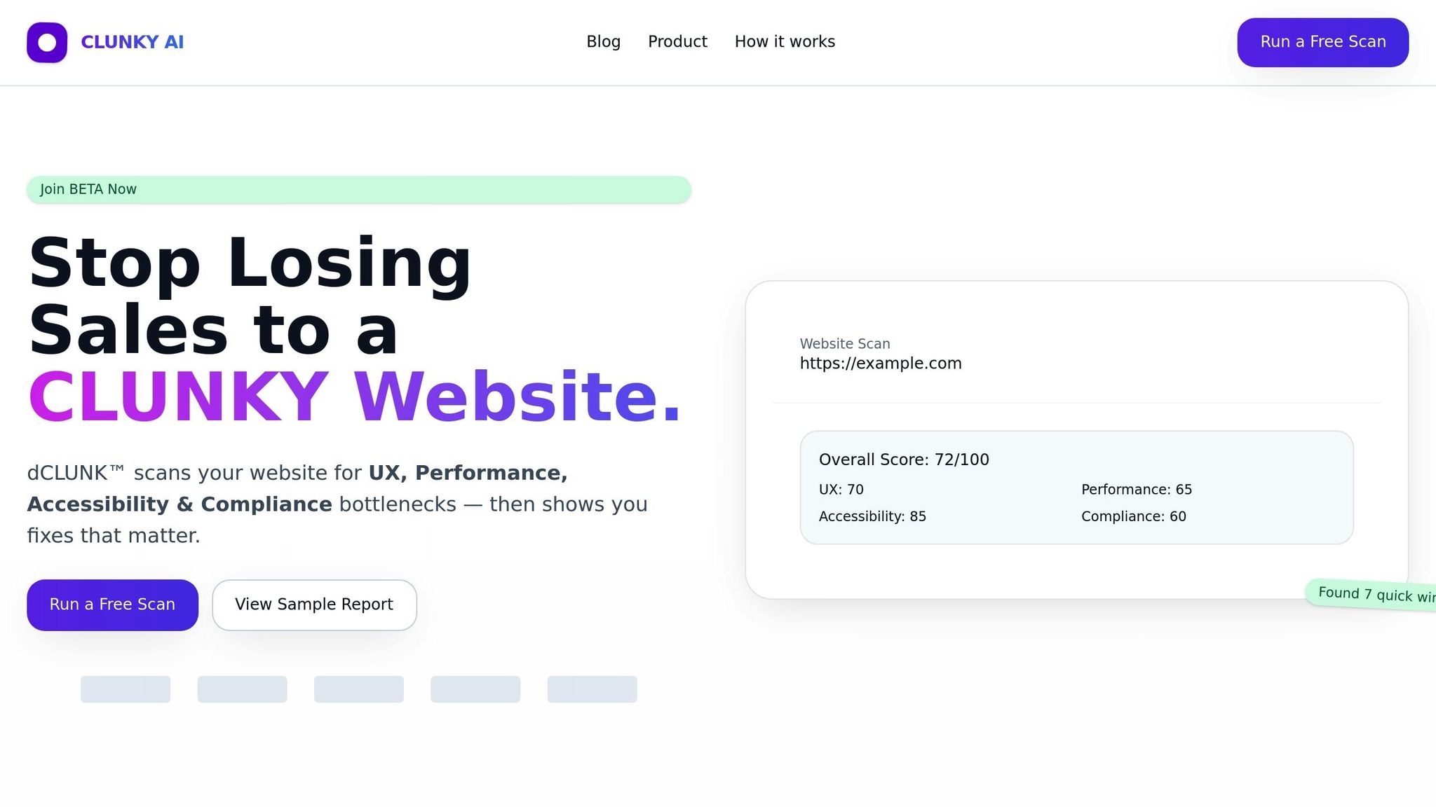
Tracking metrics is one thing, but figuring out exactly where to improve can feel like searching for a needle in a haystack. That’s where CLUNKY.ai's dCLUNK™ scanning tool steps in, offering website managers a way to fine-tune user engagement by refining micro-interactions.
This tool evaluates your website through four key lenses: user experience (UX), performance, accessibility, and compliance. Each of these plays a role in how well your micro-interactions resonate with users. From there, dCLUNK pinpoints specific areas where tweaks can make a noticeable difference.
Finding Areas for Micro-Interaction Improvements
dCLUNK™ doesn’t just skim the surface - it digs deep to identify where your micro-interactions can pack more punch. By simply entering your website URL, the tool fetches metrics, runs diagnostic checks, and generates scores.
For user experience, it highlights issues like cluttered layouts, unclear hierarchies, or ineffective call-to-action (CTA) buttons. These are prime opportunities for micro-interactions to shine. For example, if your navigation lacks clear visual indicators, adding hover effects could make a world of difference. Or, if buttons seem unresponsive, animated feedback might be just what’s needed to reassure users.
The tool also tackles performance bottlenecks by analyzing metrics that impact loading times. When delays occur, micro-interactions like loading spinners can help manage user expectations and reduce frustration.
Accessibility checks are another standout feature. dCLUNK™ runs automated tests based on WCAG standards, flagging issues like poor color contrast, missing focus indicators, or improper labeling. These insights are key to ensuring your micro-interactions work seamlessly for everyone, including users relying on screen readers or keyboard navigation.
Lastly, the compliance analysis focuses on elements like cookie banners, consent flows, and forms - areas where micro-interactions guide users through processes and confirm their actions.
Improving UX with Actionable Recommendations
dCLUNK doesn’t stop at identifying problems - it gives you a roadmap to fix them. What sets it apart is its ability to provide prioritized, actionable recommendations tailored to the issues it uncovers. This means you’re not just handed a list of problems; you’re shown where to start and how to make the biggest impact.
For example, the tool might suggest adding hover effects to navigation menus, introducing animated loading indicators for slow pages, or creating microcopy for error messages. These recommendations address usability gaps while keeping accessibility and compliance in check.
The prioritization system ensures you tackle the most impactful changes first. Say the scan reveals that your checkout button lacks visual feedback - a critical point in the user journey. This issue would take precedence over less urgent tweaks like decorative animations.
Real-world results back up the tool’s effectiveness. One case study showed that adding progress bars to onboarding checklists increased activation rates by up to 47% in six months. Another example involved a retail site implementing animated confirmation for its "Add to Cart" button, reducing user hesitation and boosting conversions.
What’s more, dCLUNK ensures your improvements don’t create new problems. By verifying elements like color contrast, ARIA labels, and keyboard-triggered animations, it helps you enhance the user experience without compromising accessibility.
Since the scans are free, you can regularly audit your site to keep your micro-interactions sharp. This ongoing fine-tuning ensures your design details consistently deliver meaningful engagement.
Conclusion: Small Details, Big Impact
Micro-interactions might seem minor, but they play a powerful role in shaping user engagement and improving website performance. These subtle design elements often mark the difference between a forgettable site and one that users genuinely enjoy exploring.
The results speak volumes. Many companies have seen measurable improvements - conversion rates jumping anywhere from 18% to 47% - simply by implementing thoughtful micro-interactions. Take Arc Browser, for example. Their playful logo animation on iOS, which lets users spin or shoot the logo after closing all tabs, is more than just a fun touch. It creates a memorable moment that fosters brand loyalty and keeps users coming back for more.
But it doesn’t stop at implementation. Continuous refinement is critical. Every hover effect, button animation, and loading indicator should have a clear purpose, enhancing the user journey. As user expectations shift and technology evolves, what works today might not work tomorrow. Regular testing and updates ensure these interactions remain effective and accessible to everyone. This ongoing process keeps your site aligned with user needs and preferences.
For those looking to take the next step, start by analyzing your user journey. Pinpoint areas of friction or hesitation using analytics tools. If you're ready for deeper insights, tools like CLUNKY.ai's dCLUNK™ can help identify subtle interaction gaps that might be holding your site back. This tool evaluates UX, performance, accessibility, and compliance, offering actionable recommendations. Companies like ShopHive, CraftMart, and SaaSify have already benefited, reporting conversion boosts of 18% to 32% after implementing targeted changes.
"We were stuck at a 1% signup rate until the CLUNKY AI crew flagged friction in our flow. After implementing their fixes, our trial conversions jumped 24%." – Avery G., Growth Lead, ShopHive
The beauty of micro-interactions lies in their simplicity and accessibility. You don’t need a massive overhaul or an extravagant budget to start seeing improvements. Small, intentional changes - a progress bar here, a subtle animation there - can transform the user experience. Each optimized interaction strengthens the overall journey, reinforcing the principles outlined throughout this guide.
In today’s crowded digital space, user attention is fleeting. Micro-interactions offer a proven way to grab that attention, guide users seamlessly, and create a positive connection with your brand. Whether you’re starting small or diving into advanced tools, these tiny design details have the potential to deliver big returns for your business.
FAQs
How do I choose the best micro-interactions to enhance my website's user experience?
To choose the best micro-interactions for your website, start by digging into user behavior and pinpointing problem areas. Tools designed to evaluate user experience can highlight issues like tricky navigation, unclear calls-to-action, or sluggish responsiveness. Once you identify these trouble spots, focus on adding micro-interactions that directly address them. Think along the lines of animated buttons, hover effects, or instant visual cues - small touches that can make a big difference.
Don’t skip user testing and feedback. Experiment with different micro-interactions in critical areas, such as forms or navigation menus, and use the insights you gather to fine-tune your approach. By zeroing in on micro-interactions that streamline tasks and make the experience more intuitive, you can dramatically improve user engagement and satisfaction.
What are the best tools and techniques for adding effective micro-interactions to a website?
To bring effective micro-interactions to life on your website, modern front-end technologies can be your best friend. Tools like CSS animations, JavaScript libraries (such as GSAP or Framer Motion), or frameworks like React and Vue.js with built-in animation support make it easier to craft smooth, engaging interactions that elevate the user experience.
If you're tackling more intricate designs, prototyping tools like Figma or Adobe XD can help you visualize and test micro-interactions before diving into development. These tools let you refine your ideas and ensure they align with your goals.
For an even more strategic approach, consider using a website scanning tool like dCLUNK™. It can pinpoint areas where micro-interactions might improve usability, accessibility, or overall engagement. By analyzing your site's performance and user experience, you can make sure every interaction serves a purpose and resonates with your audience.
How can I make sure the micro-interactions on my website are accessible to everyone, including users with disabilities?
To make your micro-interactions accessible to everyone, here are some important practices to follow:
- Ensure proper contrast and focus states so they align with accessibility guidelines.
- Add clear and descriptive ARIA labels and roles to all interactive elements.
- Verify that every interaction works seamlessly with keyboard navigation.
- Test your website using assistive technologies, such as screen readers, to uncover any potential accessibility challenges.
Using accessibility analysis tools on a regular basis can help pinpoint and fix issues, creating a more inclusive experience for all users.
Explore the six basics
Every Clunky AI article maps back to one or more of the questions a business site has to answer.
Related Posts
Tags AccessibilityPerformanceUser Experience
Category Website Optimization